Introduction To Color Mixing
What Is Color Mixing?
Color mixing is the process of combining two or more colors to create new colors. It's a fundamental skill for artists across all mediums, whether it's painting, drawing, sculpture, or even digital art. Color mixing allows artists to expand their palette beyond pre-mixed colors, giving them the freedom to express their creativity and achieve unique visual effects.
Why Is Color Mixing Important For Artists?
Color mixing is essential for artists for several reasons:
Expanded Palette: By learning to mix colors, artists are not limited to the colors available in tubes or pans. They can create an infinite range of hues, shades, and tones to perfectly match their artistic vision.
Realistic Representation: Accurate color mixing is crucial for creating realistic depictions of light, shadow, and textures. It allows artists to capture the nuances of the world around them and translate them onto their canvas.
Emotional Expression: Colors evoke emotions and moods. Mastering color mixing allows artists to manipulate colors to elicit specific feelings in their audience.
Creativity and Experimentation: Color mixing encourages experimentation and playfulness. It empowers artists to explore different color combinations and develop their unique artistic style.
Brief Overview Of Color Theory
Color theory is the study of how colors interact and how they can be combined to create pleasing visual effects. It provides artists with a framework for understanding color relationships and making informed decisions about color choices. Key concepts in color theory include:
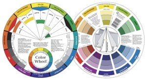
The Color Wheel: A visual representation of the relationships between colors.
Primary Colors: Red, yellow, and blue, which cannot be created by mixing other colors.
Secondary Colors: Green, orange, and purple, created by mixing primary colors.
Tertiary Colors: Created by mixing a primary and a secondary color.
Complementary Colors: Colors opposite each other on the color wheel, which create contrast when used together.
Analogous Colors: Colors next to each other on the color wheel, which create harmony when used together.
Types Of Color Mixing
There are two main types of color mixing:
Subtractive Color Mixing: Used with pigments, such as paints, dyes, and inks. It involves mixing colors that absorb specific wavelengths of light, resulting in a darker color.
Additive Color Mixing: Used with light, such as in digital displays and stage lighting. It involves mixing different colored lights, which combine to create a brighter color.
Tools And Materials For Color Mixing
To mix colors effectively, artists need a few essential tools and materials:
Palette: A surface for mixing colors, such as a palette knife, a plastic palette, or a piece of glass.
Brushes: Different sizes and shapes for applying and blending colors.
Paints or Pigments: A variety of colors in the chosen medium (e.g., oils, acrylics, watercolors).
Mediums: Substances that modify the properties of paint, such as drying time, consistency, or glossiness.
Palette Knife: A tool for mixing colors and applying thick layers of paint.
Rags or Paper Towels: For wiping brushes and cleaning up spills.
The Role Of Light In Color Perception
Light plays a crucial role in how we perceive colors. The type of light and its intensity can dramatically affect the appearance of a color. Artists need to consider the lighting conditions under which their artwork will be viewed to ensure accurate color representation. Natural daylight is often considered the ideal light for viewing artwork, as it reveals the full range of colors.
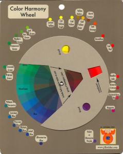
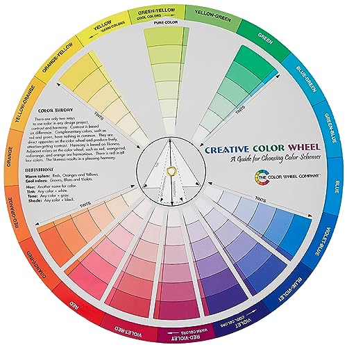
Understanding The Color Wheel
The color wheel is a visual tool that organizes colors based on their relationships with one another. It's a fundamental reference for artists, designers, and anyone working with color. By understanding the color wheel, you can make informed decisions about color combinations and create visually pleasing artwork.
Primary Colors
Primary colors are the foundation of the color wheel and cannot be created by mixing other colors. They are:
Red: A warm, vibrant color associated with passion, energy, and excitement.
Yellow: A bright, cheerful color associated with sunshine, happiness, and optimism.
Blue: A cool, calming color associated with tranquility, peace, and stability.
Secondary Colors
Secondary colors are created by mixing two primary colors in equal proportions. They are:
Green: Created by mixing yellow and blue.
Orange: Created by mixing red and yellow.
Purple: Created by mixing red and blue.
Tertiary Colors
Tertiary colors are created by mixing a primary color with a neighboring secondary color. There are six tertiary colors:
Red-Orange: Created by mixing red and orange.
Yellow-Orange: Created by mixing yellow and orange.
Yellow-Green: Created by mixing yellow and green.
Blue-Green: Created by mixing blue and green.
Blue-Violet: Created by mixing blue and purple.
Red-Violet: Created by mixing red and purple.
Warm And Cool Colors
Colors can be categorized as either warm or cool based on their psychological associations and their position on the color wheel.
Warm Colors: Red, orange, and yellow are considered warm colors. They evoke feelings of warmth, energy, and excitement.
Cool Colors: Blue, green, and purple are considered cool colors. They evoke feelings of calmness, tranquility, and serenity.
Complementary Colors
Complementary colors are opposite each other on the color wheel. When used together, they create high contrast and visual interest. Some examples of complementary color pairs include:
Red and Green
Blue and Orange
Yellow and Purple
Analogous Colors
Analogous colors are next to each other on the color wheel. They share a similar color temperature and create harmonious color schemes. Some examples of analogous color groups include:
Red, Orange, and Yellow
Blue, Green, and Purple
Yellow, Green, and Blue-Green
The Relationship Between Colors
Understanding the relationships between colors on the color wheel is crucial for creating effective color schemes.
Hue: The pure state of a color, without any white or black added.
Value: The lightness or darkness of a color.
Saturation: The intensity or purity of a color.
By manipulating these three properties, artists can create a wide range of colors and achieve specific visual effects.
Color Theory Basics
Understanding the fundamental principles of color theory will significantly enhance your ability to mix colors effectively and create harmonious artwork.
Hue
Hue refers to the pure state of a color, representing its position on the color wheel. It is the name we give to a color, such as red, blue, or green. When we talk about "mixing colors," we are essentially mixing different hues to create new ones.
Saturation
Saturation, also known as chroma or intensity, refers to the purity or vividness of a color. A highly saturated color appears bright and intense, while a less saturated color appears duller and more muted. Saturation can be adjusted by adding white (to create tints), black (to create shades), or gray (to create tones).
Value
Value describes the lightness or darkness of a color. It's a crucial element in creating depth and dimension in artwork. A high-value color is light, while a low-value color is dark. Artists often use value scales to understand the relationships between different values of a color.
Tints, Tones, And Shades
Tints: Created by adding white to a hue, making it lighter and less saturated.
Tones: Created by adding gray to a hue, making it less saturated and potentially lighter or darker depending on the value of the gray.
Shades: Created by adding black to a hue, making it darker and less saturated.
Color Temperature
Color temperature refers to the warmth or coolness of a color. Warm colors (reds, oranges, yellows) tend to advance in a composition, while cool colors (blues, greens, purples) recede. Color temperature can be used to create depth, atmosphere, and mood in artwork.
Color Schemes And Harmonies
Color schemes are combinations of colors that create a sense of visual order and balance. They are based on the relationships between colors on the color wheel. Some common color schemes include:
Monochromatic: Using different tints, tones, and shades of a single hue.
Complementary: Using two colors opposite each other on the color wheel.
Analogous: Using three or more colors next to each other on the color wheel.
Triadic: Using three colors equally spaced around the color wheel.
Understanding color schemes helps artists choose colors that work well together and create visually pleasing compositions.
Essential Color Mixing Techniques
This section will delve into the practical aspects of color mixing, equipping you with the fundamental techniques to create a wide array of colors from a limited set of pigments.
Mixing Primary Colors
While primary colors cannot be created by mixing other colors, understanding how they interact is crucial for successful color mixing. When you combine primary colors, you create secondary colors. For example:
Red + Yellow = Orange
Yellow + Blue = Green
Blue + Red = Purple
The proportions of each primary color you use will determine the exact hue of the secondary color you create.
Mixing Secondary Colors
Secondary colors can be mixed with each other or with primary colors to create tertiary colors. For instance:
Orange + Green = Brown
Green + Purple = Slate
Purple + Orange = Brown
These combinations offer a vast range of possibilities for creating subtle variations and nuanced colors.
Mixing Tertiary Colors
Tertiary colors are less common than primary and secondary colors but are equally important for achieving a rich and diverse palette. You can create tertiary colors by mixing a primary color with a neighboring secondary color. For example:
Red + Orange = Red-Orange
Yellow + Green = Yellow-Green
Blue + Purple = Blue-Violet
Experimenting with different proportions of each color will allow you to explore the full spectrum of tertiary colors.
Creating Tints And Shades
Tints and shades are variations of a hue that are created by adding white or black, respectively.
Tints: To create a tint, simply add white to a hue. The more white you add, the lighter and less saturated the tint becomes. Tints are often used to depict highlights, light areas, and pastel tones.
Shades: To create a shade, add black to a hue. The more black you add, the darker and less saturated the shade becomes. Shades are typically used to depict shadows, dark areas, and rich, deep colors.
Achieving Neutrals And Grays
Neutrals, such as grays and browns, are essential for creating balance and harmony in artwork. They can be achieved by mixing complementary colors or by combining all three primary colors in varying proportions. The specific ratios of each color will determine the warmth or coolness of the resulting neutral.
The Importance Of Practice And Experimentation
Color mixing is a skill that develops with practice and experimentation. Don't be afraid to try new combinations and explore the possibilities of your palette. Keep a color mixing journal to document your experiments and track your progress. The more you practice, the more confident you'll become in your ability to mix colors and achieve your desired results.
Advanced Color Mixing Concepts
Once you've mastered the basics of color mixing, you can delve into more advanced concepts that will elevate your artistic practice and allow you to create more nuanced and sophisticated color palettes.
Optical Color Mixing
Optical color mixing is a technique that relies on the viewer's eye to blend colors rather than physically mixing them on the palette. This is often achieved through pointillism, a technique where small dots of different colors are placed close together, creating the illusion of a new color when viewed from a distance. This technique can create vibrant, shimmering effects and add a sense of depth and dimension to artwork.
Color Mixing With Different Mediums (Oils, Acrylics, Watercolors)
Each artistic medium has unique properties that affect how colors interact and blend.
Oils: Oil paints have a slow drying time, allowing for greater blending and manipulation of colors. They offer rich, saturated colors and a glossy finish.
Acrylics: Acrylic paints dry quickly, making them ideal for layering and glazing techniques. They are versatile and can mimic the effects of both oil and watercolor paints.
Watercolors: Watercolors are transparent and luminous, creating delicate washes of color. They are known for their fluidity and ability to create atmospheric effects.
Understanding the characteristics of different mediums is essential for adapting your color mixing techniques and achieving the desired results.
Glazing And Layering
Glazing and layering are techniques that involve applying thin, transparent layers of color over each other to create depth, luminosity, and complex color interactions.
Glazing: This technique involves applying a thin, transparent layer of color over a dried layer of paint. Glazes can be used to modify the hue, value, or saturation of the underlying color, as well as to create subtle shifts and transitions.
Layering: This technique involves building up multiple layers of opaque or semi-opaque paint to create depth and texture. Layering can be used to create the illusion of light and shadow or to add complexity and richness to a composition.
Color Mixing For Specific Effects (Shadows, Highlights, Textures)
Color mixing can be used to create a wide range of visual effects in artwork.
Shadows: Shadows are typically created by mixing a darker version of the local color with a complementary color. This creates a sense of depth and realism.
Highlights: Highlights are typically created by adding white or a lighter version of the local color. This creates a sense of brightness and luminosity.
Textures: Texture can be created by using different brushstrokes, varying the thickness of paint, or incorporating other materials into the artwork. Color mixing can be used to enhance the appearance of texture and create a more realistic or tactile effect.
By mastering these advanced color mixing techniques, you can elevate your artistic practice and create more nuanced and sophisticated artwork.
Color Mixing For Specific Artistic Styles
Color mixing techniques are not one-size-fits-all. Different artistic styles often call for unique approaches to color mixing, emphasizing specific color palettes, techniques, or effects to achieve the desired visual aesthetic.
Color Mixing For Realism
Realism aims to depict subjects as they appear in the natural world, with accurate colors, light, and shadow. For realistic painting, artists often use a wide range of colors and subtle gradations to capture the nuances of their subjects. They may use glazing and layering techniques to create depth and dimension, and they often rely on observation and color matching skills to accurately portray the colors they see.
Color Mixing For Impressionism
Impressionism is characterized by its focus on capturing the fleeting effects of light and atmosphere. Impressionist artists often use a lighter palette and looser brushstrokes to create a sense of movement and vibrancy. They may use optical color mixing techniques, such as placing small dots of complementary colors next to each other, to create the illusion of a new color.
Color Mixing For Abstract Art
Abstract art is not bound by the constraints of representation and allows for greater freedom in color experimentation. Abstract artists may use bold, saturated colors, unexpected color combinations, and expressive brushstrokes to evoke emotions and create visual interest. They may also explore color relationships, such as complementary or analogous colors, to create dynamic compositions.
Color Mixing For Digital Art
Digital art offers a vast array of tools and techniques for color mixing. Digital artists can use color pickers, sliders, and blending modes to create precise color choices and effects. They can also experiment with layering, opacity, and filters to achieve unique visual styles. Digital art allows for greater flexibility and experimentation than traditional mediums, as mistakes can be easily undone and colors can be endlessly adjusted.
Adapting Color Mixing Techniques To Your Style
Every artist has a unique style and vision. It's important to adapt color mixing techniques to suit your individual preferences and artistic goals. Experiment with different approaches, explore new color combinations, and don't be afraid to break the rules. The most important thing is to find what works best for you and to use color to express your creativity and vision.
Troubleshooting Common Color Mixing Problems
Even with a solid understanding of color theory and techniques, artists can encounter challenges when mixing colors. This section addresses common issues and offers solutions to help you overcome obstacles and achieve the desired results.
Muddy Colors
Muddy colors often result from overmixing or using too many colors in a mixture. To avoid muddy colors:
Use a limited palette: Start with a few essential colors and gradually introduce more as needed.
Mix colors lightly: Avoid overworking the mixture, as this can dull the colors and create muddiness.
Clean your brush between colors: This prevents unwanted colors from contaminating your mixture.
Use transparent colors: Transparent colors allow light to pass through, creating brighter and more vibrant mixtures.
Overly Saturated Colors
Overly saturated colors can appear garish and unrealistic. To tone down saturation:
Add a complementary color: A small amount of the complementary color can neutralize the intensity of a color.
Add white or black: Adding white will create a tint, while adding black will create a shade, both of which will reduce saturation.
Use glazing techniques: Applying thin, transparent layers of color can help to control saturation and create subtle variations.
Color Matching Challenges
Matching colors accurately can be tricky, especially when working from reference photos or real-life objects. To improve your color matching skills:
Practice color mixing exercises: Regularly mixing colors and comparing them to reference materials will help train your eye and improve your color perception.
Use a color mixing chart: A color mixing chart can provide a visual reference for different color combinations and help you understand how to achieve specific hues.
Consider the lighting conditions: The type of light and its intensity can significantly affect the appearance of a color.
Maintaining Color Consistency
Maintaining color consistency throughout a painting can be challenging, especially when working on a large piece or over multiple sessions. To ensure consistency:
Mix enough paint at the beginning: Estimate the amount of paint you'll need and mix it all at once to avoid slight variations in color.
Label your mixtures: If you need to mix more paint later, labeling your mixtures will help you recreate the same color.
Use a consistent light source: Changes in lighting can affect how you perceive colors.
Tips For Correcting Color Mistakes
Don't be afraid to make mistakes – they're a natural part of the learning process. Here are some tips for correcting color errors:
Scrape off wet paint: If the paint is still wet, you can scrape it off with a palette knife and start over.
Apply a new layer of paint: If the paint has dried, you can apply a new layer of paint to cover the mistake.
Use glazing to adjust color: Thin, transparent layers of color can be used to modify the hue, value, or saturation of underlying colors.
Embrace the imperfection: Sometimes, a "mistake" can lead to unexpected and interesting results. Don't be afraid to experiment and embrace the creative process.
Resources For Further Learning
There are many resources available to help you deepen your understanding of color mixing and troubleshooting. These include:
Books and tutorials: Many books and online tutorials offer in-depth instruction on color theory and mixing techniques.
Workshops and classes: Taking a workshop or class can provide hands-on experience and guidance from experienced artists.
Online communities and forums: Connecting with other artists online can provide a supportive environment for sharing knowledge and troubleshooting challenges.
By actively seeking out resources and continuing to learn and experiment, you can overcome common color mixing problems and achieve your artistic goals.
Practical Color Mixing Exercises
To solidify your understanding of color mixing and develop your skills, engaging in practical exercises is essential. These exercises will allow you to apply the theoretical knowledge you've gained and gain hands-on experience with color manipulation.
Creating A Color Chart
A color chart is a visual reference tool that displays a range of colors created by mixing different pigments. To create a color chart, follow these steps:
Choose your pigments: Select a limited palette of primary, secondary, and perhaps a few tertiary colors.
Prepare your surface: Use a canvas, paper, or palette to create your chart.
Divide the surface: Divide the surface into squares or rectangles, one for each color you plan to mix.
Mix and apply colors: Start by mixing the primary colors and applying them to the corresponding squares. Then, mix secondary and tertiary colors, gradually filling in the chart.
Label the colors: Label each square with the names of the colors used to create it.
A color chart is a valuable reference tool that you can refer to as you mix colors for your artwork.
Mixing Skin Tones
Achieving realistic skin tones is a challenging but rewarding aspect of color mixing. Skin tones are complex and vary depending on factors such as ethnicity, lighting, and underlying blood vessels. To mix skin tones, start with a base color that matches the overall skin tone of your subject. Then, add small amounts of red, yellow, blue, and white to adjust the hue, value, and saturation until you achieve the desired effect.
Painting Landscapes And Still Lifes
Landscapes and still lifes offer ample opportunities to practice color mixing in real-world scenarios. When painting landscapes, observe the different colors and how they change depending on the light and atmosphere. Pay attention to the subtle variations in greens, blues, and browns, and use color mixing to capture the nuances of the scene. For still lifes, focus on accurately depicting the colors of the objects and the way light interacts with them.
Experimenting With Color Mixing In Different Lighting Conditions
The type of light and its intensity can dramatically affect the appearance of colors. To understand how light influences color, try painting the same subject under different lighting conditions. Observe how the colors change in warm sunlight, cool shade, or artificial light. This exercise will help you develop your ability to adapt your color mixing techniques to different situations and achieve accurate and convincing results.
Conclusion
As you embark on your artistic journey, mastering color mixing will undoubtedly unlock new realms of creative expression. By understanding the principles of color theory, practicing essential techniques, and exploring advanced concepts, you'll gain the confidence and skills to create vibrant, harmonious, and captivating artwork.
Recap Of Key Color Mixing Principles
Let's revisit the fundamental principles that form the foundation of successful color mixing:
The Color Wheel: A visual tool that guides color selection and harmonious combinations.
Primary, Secondary, and Tertiary Colors: The building blocks of all other colors.
Hue, Saturation, and Value: The three properties that define a color.
Tints, Tones, and Shades: Variations of a hue created by adding white, gray, or black.
Color Temperature: The warmth or coolness of a color, influencing its perceived energy and depth.
Color Schemes: Strategic combinations of colors that create visual harmony and balance.
Encouragement To Continue Exploring Color
Color mixing is an ongoing journey of discovery and experimentation. Embrace the joy of playing with colors, trying new combinations, and pushing the boundaries of your artistic expression. The more you practice, the more intuitive and confident your color choices will become.
Resources For Further Learning And Inspiration
The world of color is vast and ever-evolving. There are countless resources available to help you deepen your knowledge and find inspiration. Here are a few suggestions:
Books and online tutorials: Dive into the works of renowned color theorists and artists. Explore tutorials that offer step-by-step guidance and practical tips.
Workshops and classes: Join workshops or classes led by experienced artists to gain hands-on experience and personalized feedback.
Museums and galleries: Immerse yourself in the works of master artists and analyze their use of color.
Nature and the world around you: Observe the colors in nature and your everyday surroundings. Draw inspiration from the subtle hues of a flower petal or the dramatic contrast of a sunset.
Final Thoughts On The Importance Of Color Mixing In Art
Color mixing is not merely a technical skill but a powerful tool for artistic expression. It allows you to communicate emotions, create depth and dimension, and tell stories through your artwork. By mastering color mixing, you will unlock a new level of creativity and enhance your ability to bring your artistic vision to life.
Summary
Color mixing is a fundamental skill for artists, enabling them to expand their palette, create realistic representations, evoke emotions, and experiment creatively. Understanding color theory, including the color wheel, primary and secondary colors, and color relationships, is essential for effective color mixing.
There are two main types of color mixing: subtractive, used with pigments, and additive, used with light. Artists utilize various tools and materials, such as palettes, brushes, and paints, to mix colors. Additionally, the type and intensity of light significantly impact color perception, making it crucial for artists to consider lighting conditions.
Mastering color mixing involves understanding fundamental concepts like hue (the pure state of a color), saturation (its vividness), and value (its lightness or darkness). Artists manipulate these properties to create tints, tones, and shades, and to control color temperature for desired effects. They also utilize color schemes, such as monochromatic, complementary, and analogous schemes, to create harmonious compositions.
Essential color mixing techniques include mixing primary, secondary, and tertiary colors, creating tints and shades, and achieving neutrals. Practice and experimentation are crucial for developing these skills. Advanced concepts like optical color mixing, working with different mediums, glazing, layering, and creating specific effects further enhance an artist's ability to manipulate color.
Color mixing techniques vary across artistic styles, with realism focusing on accuracy, impressionism on capturing light and atmosphere, abstract art on emotional expression, and digital art offering unique tools and flexibility. Artists adapt these techniques to their individual style and preferences.
Even experienced artists encounter challenges like muddy colors, overly saturated colors, color matching difficulties, and maintaining consistency. Understanding common problems and their solutions is key to overcoming these obstacles. Resources like books, tutorials, workshops, and online communities can provide further guidance and support.
Practical exercises, such as creating color charts, mixing skin tones, painting landscapes and still lifes, and experimenting with lighting conditions, solidify understanding and build skills. By continuously exploring and refining their color mixing abilities, artists can unlock their full creative potential and produce captivating artwork.