
The color wheel, a fundamental tool in the world of art and design, is a visual representation of the colors that make up the visible spectrum. It serves as a guide for artists, helping them understand color relationships, create harmonious compositions, and unlock a world of creative possibilities. In this article, we will explore the history, structure, and practical applications of the color wheel in the realm of art.
A Brief History of the Color Wheel
The concept of the color wheel has a rich history dating back to ancient times. The first recorded attempt at organizing colors into a wheel-like structure can be traced to Sir Isaac Newton in the 17th century. Newton used a prism to split white light into its constituent colors, which he then arranged in a circular fashion to illustrate the spectrum.
The color wheel gained prominence in the 18th and 19th centuries as artists and scientists alike sought to understand the principles of color theory. It was further refined and popularized by artists like Johann Wolfgang von Goethe and Michel Eugène Chevreul, who made significant contributions to our understanding of color relationships.
Structure of the Color Wheel
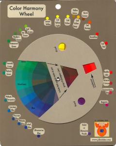
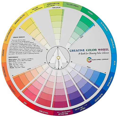
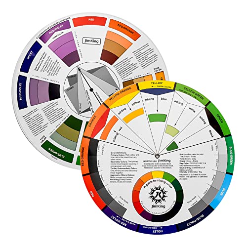
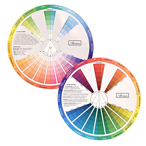
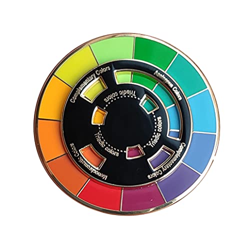
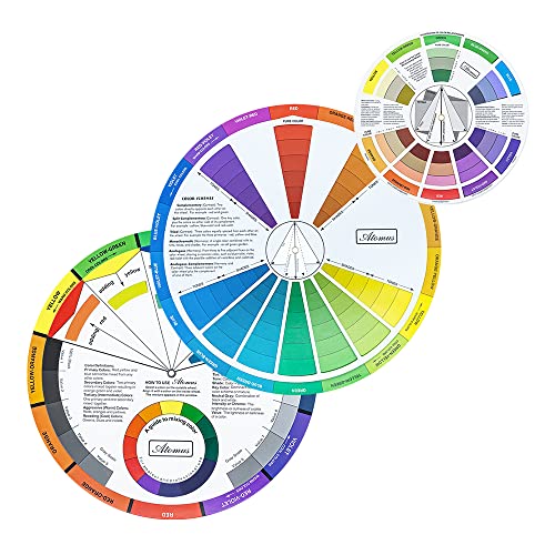
The traditional color wheel is typically divided into three primary categories: primary colors, secondary colors, and tertiary colors.
Primary Colors:
Red
Blue
Yellow
These three colors are considered fundamental because they cannot be created by mixing other colors together. All other colors are derived from combinations of these primary hues.
Secondary Colors:
Green (formed by mixing yellow and blue)
Orange (formed by mixing red and yellow)
Purple (formed by mixing blue and red)
Secondary colors result from mixing equal parts of two primary colors.
Tertiary Colors:
Tertiary colors are created by mixing a primary color with a neighboring secondary color. These combinations result in a range of nuanced colors, such as:
Red-orange
Yellow-orange
Yellow-green
Blue-green
Blue-purple
Red-purple
Practical Applications in Art
The color wheel is a valuable tool for artists, providing guidance on color relationships, harmony, and contrast. Here are some practical applications of the color wheel in art:
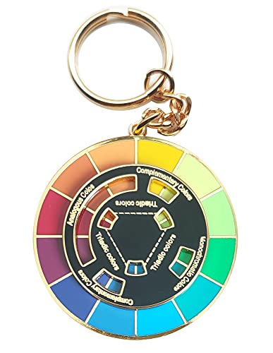
Color Harmony:
Artists use the color wheel to create harmonious color schemes. Complementary colors, which are located opposite each other on the wheel (e.g., red and green or blue and orange), create strong visual contrast when used together. Analogous colors, situated next to each other (e.g., blue, blue-green, and green), create a sense of unity and harmony in a composition.
Color Mixing:
Understanding the color wheel is crucial for mixing and achieving the desired hues in various painting mediums. For instance, blending two primary colors results in a secondary color, while mixing complementary colors can neutralize or "gray down" a color.
Color Temperature:
The color wheel also helps artists grasp the concept of color temperature. Warm colors (such as red and yellow) evoke feelings of heat, energy, and passion, while cool colors (such as blue and green) convey a sense of calmness, tranquility, and coolness. Artists can use this knowledge to evoke specific moods in their artworks.
Color Contrast:
Artists employ the color wheel to create visual interest and contrast in their compositions. By placing complementary or contrasting colors next to each other, they can make certain elements stand out and capture the viewer's attention.
The color wheel is a cornerstone of art and design, serving as a fundamental tool for artists to explore, understand, and harness the power of color. Whether creating harmonious color palettes, experimenting with color mixing, or using color to convey emotions and moods, the color wheel provides a structured framework for creative expression.
Artists across various disciplines, from painting and graphic design to interior decorating and fashion, rely on the principles of the color wheel to make informed color choices that resonate with their audiences. In essence, the color wheel is not just a tool; it's a vibrant spectrum of creativity that continues to inspire and guide artists in their quest to capture the beauty and diversity of the world through color.