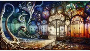

Understanding the World of Color
The world around us is a symphony of colors, a vibrant tapestry that evokes emotions, communicates ideas, and enriches our lives. From the fiery reds of a sunset to the tranquil blues of a clear sky, color is an essential part of our existence. But what exactly is color, and how does it work? In this section, we will embark on a journey to explore the fascinating world of color, delving into its science, psychology, cultural significance, and role in nature.
What Is Color?
Color is not an inherent property of objects, but rather a perception created by our brains in response to light. When light strikes an object, some wavelengths are absorbed while others are reflected. The reflected wavelengths enter our eyes and are interpreted by our brains as color.
The Science Behind Color Perception
Our eyes contain specialized cells called cones, which are sensitive to different wavelengths of light. There are three types of cones, each responsible for detecting red, green, or blue light. When light enters our eyes, these cones send signals to our brains, which combine the information to create the perception of color.
The Psychology of Color
Colors have a powerful impact on our emotions and behaviors. Warm colors like red and orange can evoke feelings of excitement, passion, and energy, while cool colors like blue and green can create a sense of calm, serenity, and tranquility. Color psychology is a complex field, and the effects of color can vary depending on individual and cultural factors.
Color In Different Cultures
Color symbolism varies widely across different cultures. For example, in Western cultures, white is often associated with purity and innocence, while in some Eastern cultures, it is associated with mourning. Red is often seen as a symbol of love and passion in many cultures, but it can also represent danger or anger. Understanding the cultural significance of color is essential for effective communication and design.
The Role of Color in Nature
Color plays a crucial role in the natural world, serving a variety of purposes. In plants, pigments like chlorophyll absorb light for photosynthesis, while other pigments attract pollinators or deter predators. In animals, colors can be used for camouflage, mating displays, or warning signals. The vibrant colors of nature are not only aesthetically pleasing but also essential for the survival and reproduction of many species.
The Color Wheel
The color wheel is a visual representation of the relationships between colors. It is a valuable tool for artists, designers, and anyone who wants to understand how colors interact.
Primary, Secondary, and Tertiary Colors
The color wheel is based on three primary colors: red, yellow, and blue. These colors cannot be created by mixing other colors. By mixing primary colors, we can create secondary colors: orange, green, and purple. Mixing primary and secondary colors results in tertiary colors.
Understanding Complementary Colors
Complementary colors are those that are opposite each other on the color wheel, such as red and green or blue and orange. When placed next to each other, complementary colors create a high contrast and can appear more vibrant.
Creating Color Harmonies
Color harmonies are combinations of colors that are aesthetically pleasing and create a sense of balance. Some common color harmonies include monochromatic (using different shades and tints of a single color), analogous (using colors that are next to each other on the color wheel), and triadic (using colors that are evenly spaced on the color wheel).
Warm vs. Cool Colors
The color wheel can be divided into warm and cool colors. Warm colors (red, orange, yellow) are associated with warmth, energy, and excitement. Cool colors (blue, green, purple) are associated with coolness, calmness, and tranquility. Understanding the difference between warm and cool colors can help you create desired moods and atmospheres in your artwork or designs.
Pigments: The Building Blocks of Color
Pigments are the heart and soul of color. They are the substances that absorb and reflect specific wavelengths of light, giving objects their characteristic hues. From the vibrant reds and yellows of a blooming flower to the deep blues and greens of a forest landscape, pigments are responsible for the kaleidoscope of colors that surrounds us. In this section, we will delve into the captivating world of pigments, exploring their natural and synthetic origins, their unique properties, and their diverse applications.
Natural Pigments
For centuries, artists and artisans relied on natural pigments derived from the earth, plants, and animals to create their colorful masterpieces. These pigments, often rich in history and cultural significance, offer a unique depth and complexity of color that continues to inspire artists today.
Earth Pigments (Ochres, Umbers, Siennas)
Earth pigments, as the name suggests, are derived from various types of clay and soil. Ochres, umbers, and siennas are among the most common earth pigments, offering a range of warm, earthy tones. Ochres are yellow, orange, or red pigments, while umbers are darker, browner shades. Siennas are yellowish-brown pigments that become reddish-brown when heated. These pigments have been used for millennia in cave paintings, frescoes, and other forms of art.
Plant-Based Pigments (Indigo, Madder)
Plants are a rich source of natural pigments, offering a wide range of colors from vibrant blues and greens to deep reds and purples. Indigo, a blue dye derived from the leaves of the Indigofera plant, has been used for centuries to color textiles and create stunning works of art. Madder, a red dye extracted from the roots of the Rubia plant, was a prized pigment in ancient times, renowned for its rich, warm hue.
Animal-Based Pigments (Cochineal, Sepia)
Animals, too, have contributed to the world of pigments. Cochineal, a vibrant red dye derived from the crushed bodies of the female cochineal insect, was once a highly sought-after pigment for its brilliant color. Sepia, a brown pigment derived from the ink sacs of cuttlefish, was a popular choice for drawing and writing in the 18th and 19th centuries.
Mineral Pigments (Ultramarine, Azurite)
Minerals have long been a source of fascination for their beauty and unique properties. Some minerals, such as lapis lazuli and azurite, contain pigments that have been used for centuries to create stunning works of art. Ultramarine, a deep blue pigment derived from lapis lazuli, was once more valuable than gold due to its rarity and intense color. Azurite, a blue copper carbonate mineral, was another popular blue pigment in the Middle Ages and Renaissance.
The Challenges of Natural Pigments
While natural pigments offer a unique charm and depth of color, they also come with their own set of challenges. Many natural pigments are not lightfast, meaning they can fade or change color over time when exposed to sunlight. They can also be difficult to obtain and may vary in quality and consistency. As a result, many artists have turned to synthetic pigments for their greater stability and predictability.
Synthetic Pigments
The development of synthetic pigments in the 19th century revolutionized the world of art and design. These pigments, created through chemical processes, offered a wider range of colors, greater stability, and lower cost than their natural counterparts.
The Rise of Synthetic Pigments
The first synthetic pigment, Prussian blue, was accidentally discovered in the early 18th century. This vibrant blue pigment quickly gained popularity among artists and spurred the development of other synthetic pigments. By the late 19th century, a vast array of synthetic pigments was available, offering artists an unprecedented range of colors and creative possibilities.
Common Synthetic Pigments (Phthalocyanines, Quinacridones)
Today, there are thousands of synthetic pigments available, each with its unique properties and applications. Some of the most common synthetic pigments include phthalocyanines (blue and green pigments known for their brilliance and lightfastness) and quinacridones (red, violet, and magenta pigments known for their intensity and transparency).
The Advantages and Disadvantages of Synthetic Pigments
Synthetic pigments offer several advantages over natural pigments, including greater lightfastness, wider range of colors, greater consistency, and lower cost. However, they can also have some drawbacks. Some synthetic pigments may be less vibrant or nuanced than natural pigments, and some may raise environmental or health concerns.
Safety Considerations with Synthetic Pigments
While most synthetic pigments are safe to use, some may contain toxic heavy metals or other harmful substances. It is essential to choose pigments from reputable manufacturers and to follow safety guidelines when handling and using them.
Paints: Bringing Color to Life
While pigments provide the raw material for color, paints are the medium through which artists and decorators bring their visions to life. Paints are complex mixtures of pigments, binders, solvents, and additives, each playing a crucial role in determining the paint's properties and performance. In this section, we will explore the fascinating world of paints, delving into their diverse types, components, and finishes.
Different Types of Paint
The world of paints is vast and varied, with a wide range of options available to suit different needs and preferences. Paints can be classified based on their chemical composition, intended use, or desired finish. Some of the most common types of paint include:
Water-Based Paints (Acrylics, Watercolors)
Water-based paints are versatile and popular for their ease of use, quick drying time, and low odor. They are made with water as the primary solvent, making them easy to clean up with soap and water. Acrylics are a popular choice for artists and hobbyists due to their vibrant colors, fast drying time, and durability. Watercolors, on the other hand, are known for their transparency and delicate washes, ideal for creating luminous landscapes and ethereal effects.
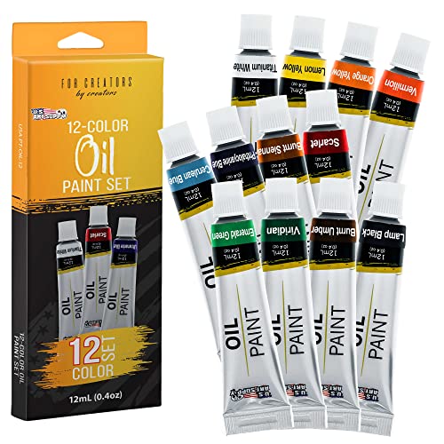
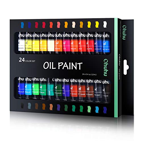
Oil-Based Paints
Oil-based paints are prized for their rich, buttery texture, slow drying time, and ability to blend seamlessly. They are made with drying oils, such as linseed oil or walnut oil, as the binder and solvent. Oil paints offer a depth and luminosity that is difficult to achieve with other types of paint, making them a favorite among many professional artists. However, they require careful handling and ventilation due to their strong odor and potential toxicity.
Solvent-Based Paints (Enamels, Lacquers)
Solvent-based paints are known for their durability, high gloss finish, and resistance to abrasion and chemicals. They are made with organic solvents, such as mineral spirits or xylene, as the primary solvent. Enamels are commonly used for painting metal surfaces, while lacquers are often used for wood finishes. Due to their strong odor and potential environmental impact, solvent-based paints require careful handling and disposal.
Specialty Paints (Metallic, Fluorescent)
In addition to the common types of paint, there are also specialty paints designed for specific purposes or effects. Metallic paints contain metal flakes that create a shimmering, reflective finish. Fluorescent paints contain pigments that absorb ultraviolet light and re-emit it as visible light, creating a glowing effect. These paints are often used for decorative purposes or to create eye-catching signage.
Paint Components
Paints are complex mixtures of various ingredients, each serving a specific purpose. The main components of paint include:
Pigments
As discussed in the previous section, pigments are the substances that give paints their color. They can be natural or synthetic, and their properties (such as hue, saturation, and lightfastness) will affect the final appearance and performance of the paint.
Binders
Binders are the substances that hold the pigment particles together and adhere them to the surface being painted. They can be natural (such as egg yolk or casein) or synthetic (such as acrylic polymers or alkyd resins). The type of binder used will affect the paint's durability, flexibility, and drying time.
Solvents
Solvents are the liquids that dissolve the binder and pigment, allowing the paint to be applied smoothly and evenly. They can be water (in water-based paints), oils (in oil-based paints), or organic solvents (in solvent-based paints). The solvent evaporates as the paint dries, leaving behind the binder and pigment.
Additives
Additives are substances added to paints to improve their performance or alter their properties. They can include thickeners (to adjust viscosity), drying agents (to speed up drying time), preservatives (to prevent mold growth), and UV stabilizers (to protect against fading).
Paint Finishes
Paint finishes refer to the final appearance of the dried paint film. They can range from high gloss (shiny and reflective) to matte (flat and non-reflective). The choice of finish will depend on the desired aesthetic effect, as well as the intended use and location of the painted surface.
Glossy Finishes
Glossy finishes are highly reflective and durable, making them ideal for surfaces that require frequent cleaning, such as kitchen cabinets or trim. However, they can also highlight imperfections in the surface.
Matte Finishes
Matte finishes are non-reflective and offer excellent hiding power for imperfections. They are often used for walls in living rooms or bedrooms. However, they can be more difficult to clean and may not be as durable as glossy finishes.
Satin Finishes
Satin finishes offer a compromise between glossy and matte finishes, providing a subtle sheen and good durability. They are a popular choice for walls in high-traffic areas, such as hallways or children's rooms.
Choosing the Right Finish for Your Project
The choice of paint finish will depend on several factors, including the desired aesthetic effect, the type of surface being painted, the intended use of the space, and the amount of wear and tear the surface will experience. It is always a good idea to consult with a paint professional or refer to manufacturer recommendations to choose the right finish for your project.
Color Theory in Practice
Color theory is not just an abstract concept for artists and designers; it's a practical tool that can be applied to various aspects of our lives. From creating visually appealing color schemes to evoking specific moods and atmospheres, understanding color theory can empower us to make informed decisions about how we use color in our personal and professional endeavors. In this section, we will explore the practical applications of color theory, delving into the art of creating color schemes and using color to influence emotions and perceptions.
Creating Color Schemes
A color scheme is a planned combination of colors that work harmoniously together. A well-chosen color scheme can create a visually appealing and cohesive aesthetic, whether it's for a painting, a website, or an interior design project. There are several different types of color schemes, each with its unique characteristics and applications.
Monochromatic Schemes
Monochromatic schemes use variations of a single hue, incorporating different tints, tones, and shades to create a sophisticated and elegant look. This type of scheme is often used in minimalist design or to create a sense of calm and tranquility. For example, a monochromatic blue scheme might include a pale blue, a medium blue, and a dark blue.
Analogous Schemes
Analogous schemes use colors that are adjacent to each other on the color wheel, creating a harmonious and visually pleasing effect. These schemes often evoke a sense of unity and can be used to create a warm or cool atmosphere depending on the chosen colors. For instance, an analogous green scheme might include yellow-green, green, and blue-green.
Complementary Schemes
Complementary schemes use colors that are opposite each other on the color wheel, resulting in a high-contrast and visually striking effect. This type of scheme can be used to create a bold and dynamic look, or to draw attention to specific elements in a design. For example, a complementary red and green scheme can be used to create a festive or energetic atmosphere.
Triadic Schemes
Triadic schemes use three colors that are evenly spaced on the color wheel, forming an equilateral triangle. These schemes offer a vibrant and balanced look, with each color playing an equal role in the overall composition. A triadic red, yellow, and blue scheme, for example, is often used in children's toys and apparel.
Split-Complementary Schemes
Similar to complementary schemes, split-complementary schemes utilize a base color and the two colors adjacent to its complement. This provides high contrast but with less tension than a complementary scheme. For instance, a split-complementary blue scheme could consist of blue, red-orange, and yellow-orange.
Using Color to Create Mood and Atmosphere
Colors have a profound impact on our emotions and perceptions. They can evoke feelings of joy, sadness, anger, or calmness, and they can influence our perception of space, temperature, and even time. By understanding the psychological effects of color, we can use it strategically to create specific moods and atmospheres in our environments.
The Effects of Different Colors on Mood
Different colors are associated with different emotions and psychological states. Warm colors like red, orange, and yellow are often associated with energy, excitement, and passion. Cool colors like blue, green, and purple are often associated with calmness, tranquility, and serenity. Neutral colors like white, gray, and brown are often associated with balance, stability, and sophistication.
Using Color to Create a Sense of Space
Color can also be used to manipulate our perception of space. Light colors tend to make a space feel larger and more open, while dark colors can make a space feel smaller and more intimate. Warm colors can make a space feel cozy and inviting, while cool colors can create a sense of spaciousness and airiness.
Color in Interior Design and Architecture
In interior design and architecture, color is a powerful tool for creating desired moods and atmospheres. For example, a bedroom painted in soft, calming colors like blue or green can promote relaxation and sleep, while a living room painted in warm, inviting colors like red or orange can encourage conversation and social interaction. In commercial spaces, color can be used to influence consumer behavior and create a brand identity.
By mastering the art of color theory, we can unlock the power of color to enhance our lives and create more meaningful and impactful experiences. Whether we are artists, designers, or simply individuals seeking to create a more harmonious and aesthetically pleasing environment, understanding color theory is an invaluable skill.
Practical Applications of Color
Color is not just a theoretical concept; it's a dynamic force that permeates every aspect of our lives. From the vibrant hues of a Van Gogh masterpiece to the subtle shades of a minimalist interior, color plays a crucial role in how we perceive and interact with the world around us. In this section, we will explore the practical applications of color, from painting techniques and artistic expression to its diverse uses in other fields like textiles, cosmetics, and industry.
Painting Techniques
Painting is an art form that has captivated humanity for millennia, and color lies at its heart. The skillful use of color can transform a blank canvas into a breathtaking masterpiece, evoking emotions, telling stories, and capturing the essence of a moment in time.
Brushstrokes and Texture
The way an artist applies paint to a surface can dramatically impact the final outcome of a painting. Different brushstrokes can create a variety of textures, from smooth and blended to rough and impasto. By varying brushstrokes and paint thickness, artists can create depth, dimension, and visual interest in their works.
Glazing and Layering
Glazing is a technique in which thin, transparent layers of paint are applied over a dried layer to create subtle shifts in color and luminosity. This technique can be used to build up complex colors and create a sense of depth and atmosphere in a painting. Layering, on the other hand, involves applying thicker, opaque layers of paint to achieve a more solid and textured effect.
Color Mixing
Color mixing is a fundamental skill for any painter. By understanding the principles of color theory and the properties of different pigments, artists can create a virtually infinite palette of colors. Whether it's mixing primary colors to create secondary colors, or adjusting the value and saturation of a hue, color mixing allows artists to achieve precise and nuanced color effects.
Creating Depth and Dimension
Color can be used to create a sense of depth and dimension in a painting. By using lighter colors in the foreground and darker colors in the background, artists can create the illusion of distance and perspective. Warm colors can appear to advance, while cool colors can recede, adding to the sense of depth and space.
Special Effects (Marbling, Sponging)
In addition to traditional painting techniques, artists can also use various tools and techniques to create unique textures and effects. Marbling involves floating pigments on the surface of water and then transferring them to paper or fabric, creating swirling, psychedelic patterns. Sponging involves applying paint with a sponge to create a textured, mottled effect. These techniques add an element of surprise and spontaneity to a painting.
Other Uses of Pigments
While pigments are most commonly associated with painting, they have a wide range of other applications in various industries and fields.
Dyes for Fabrics and Fibers
Pigments are essential for creating vibrant and colorful textiles. Natural dyes like indigo and madder have been used for centuries to color fabrics, while synthetic dyes offer a wider range of colors and greater stability. Pigments are also used to create colorful prints and patterns on fabrics.
Colorants in Food and Cosmetics
Pigments are used to add color and visual appeal to food and cosmetic products. Natural pigments like carotene (orange) and anthocyanin (red, purple, blue) are often used in food coloring, while synthetic pigments are used in cosmetics like lipstick, eyeshadow, and blush. The safety of these pigments is closely regulated to ensure consumer health.
Industrial Applications
Pigments have various industrial applications, such as in paints, inks, plastics, and coatings. They are also used in the production of ceramics, glass, and other materials. In the automotive industry, pigments are used to create colorful car finishes.
Medical Applications
Pigments are also used in medical applications. For example, fluorescent pigments are used in medical imaging to help visualize internal organs and tissues. Pigments are also used in diagnostic tests and to mark surgical sites.
Artistic and Creative Applications
Beyond painting, pigments are used in various artistic and creative endeavors. They are used in crafts like pottery, sculpture, and jewelry making. Pigments are also used in calligraphy and other forms of decorative writing.
By understanding the diverse applications of pigments, we can appreciate their versatility and importance in our daily lives. From the clothes we wear to the food we eat, pigments play a vital role in enhancing our world with color and beauty.
The Art of Color Mixing
Color mixing is a fascinating and essential aspect of working with pigments and paints. It is the process of combining different colors to create new hues, tones, and shades, expanding the artist's palette and enabling them to achieve a broader range of visual effects. In this section, we will delve into the art of color mixing, exploring its underlying principles, techniques, and practical applications.
Understanding Color Mixing Principles
Before diving into the practical aspects of color mixing, it is essential to grasp the fundamental principles that govern how colors interact with one another. These principles are rooted in the science of light and perception, providing a framework for understanding how to achieve desired color outcomes.
Subtractive vs. Additive Color Mixing
There are two primary models of color mixing: subtractive and additive. Subtractive color mixing is the most common method used in painting and printing, where pigments absorb certain wavelengths of light and reflect others. When pigments are mixed, they subtract more wavelengths, resulting in darker colors. In contrast, additive color mixing is used in digital displays and lighting, where colored lights are combined to create new colors. When lights are mixed, they add more wavelengths, resulting in brighter colors.
The Role of White and Black
In subtractive color mixing, white and black play crucial roles. White is the absence of all color, and when added to a pigment, it lightens the hue, creating a tint. Black is the presence of all colors, and when added to a pigment, it darkens the hue, creating a shade. By adjusting the amount of white or black added, artists can create a wide range of tints and shades from a single pigment.
Tints, Tones, and Shades
Tints, tones, and shades are variations of a hue created by adding white, gray, or black, respectively. A tint is a lighter version of a hue, a tone is a more muted or grayed version, and a shade is a darker version. These variations allow artists to create a greater sense of depth and dimension in their artwork.
The Importance of Value
Value refers to the lightness or darkness of a color. It is one of the most critical aspects of color mixing, as it determines the overall contrast and balance of a composition. By carefully controlling value, artists can create the illusion of light and shadow, form, and depth in their paintings.
The Impact of Undertones
Undertones are the subtle hints of other colors present within a hue. They can be warm (yellow, orange, red) or cool (blue, green, violet), and they significantly impact how colors interact with each other. Understanding undertones is essential for creating harmonious color schemes and achieving desired results in color mixing.
Creating Custom Colors
One of the most exciting aspects of color mixing is the ability to create unique and personalized colors. By experimenting with different combinations of pigments and adjusting their proportions, artists can achieve a virtually limitless palette of colors.
Tips for Mixing Your Own Colors
When mixing colors, it's important to start with a clean palette and use a small amount of each pigment at a time. Gradually add more pigment until you achieve the desired hue. It's also helpful to test the mixed color on a scrap piece of paper or canvas to see how it looks when dry, as some colors may change slightly as they dry.
Common Color Mixing Mistakes
One common mistake in color mixing is overmixing, which can result in muddy or dull colors. It's better to mix colors gently and leave some streaks or variations to create visual interest. Another mistake is using too much black or white, which can overpower the other pigments and create unnatural-looking colors.
Using a Color Mixing Chart
A color mixing chart is a valuable tool for understanding how different colors interact and for predicting the outcome of color mixtures. It typically shows the primary colors, secondary colors, and a range of tertiary colors created by mixing different proportions of the primaries. By referring to a color mixing chart, artists can develop a better understanding of color relationships and gain confidence in their ability to create custom colors.
By mastering the art of color mixing, artists can unlock a world of creative possibilities, expanding their palette and achieving greater control over their artistic expression. Whether it's creating subtle nuances of color or bold, vibrant hues, color mixing allows artists to bring their visions to life with greater precision and artistry.
Exploring the World of Pigments and Paints
The world of pigments and paints is vast and varied, offering endless opportunities for exploration and discovery. Whether you are a seasoned artist, a budding hobbyist, or simply someone with a passion for color, there are countless ways to delve deeper into this fascinating realm. In this section, we will embark on a journey of exploration, uncovering hidden gems in art supply stores, drawing inspiration from art museums and galleries, and experimenting with different mediums and techniques.
Visiting Art Supply Stores
Art supply stores are treasure troves for artists and art enthusiasts alike. They offer a dazzling array of pigments, paints, brushes, canvases, and other tools and materials, catering to every creative need and budget.
What to Look for When Choosing Pigments and Paints
When selecting pigments and paints, consider factors such as lightfastness, pigment concentration, and color intensity. Lightfast pigments are more resistant to fading over time, while highly pigmented paints offer greater coverage and vibrancy. It's also important to choose pigments and paints that are compatible with your chosen medium and technique.
Asking for Expert Advice
Don't hesitate to ask for assistance from the knowledgeable staff at art supply stores. They can offer valuable insights and recommendations based on your experience level, artistic goals, and budget. Many stores also offer workshops and demonstrations, providing a great opportunity to learn new techniques and discover new products.
Exploring Different Brands and Products
Each brand of pigments and paints has its unique characteristics and strengths. Some brands specialize in traditional artist-grade materials, while others offer more affordable options for beginners and hobbyists. Take the time to explore different brands and products, comparing their quality, price, and suitability for your needs.
Considering Safety and Environmental Impact
When choosing art supplies, it's important to consider their safety and environmental impact. Look for pigments and paints that are labeled as non-toxic and low in volatile organic compounds (VOCs). These products are safer for both you and the environment.
Trying Before You Buy
Many art supply stores offer sample sizes or tester pots of paints, allowing you to try out different colors and brands before committing to a larger purchase. This is a great way to experiment and find the perfect products for your artistic endeavors.
Exploring Art Museums and Galleries
Art museums and galleries are not only repositories of artistic treasures, but also invaluable resources for learning about pigments, paints, and the history of art. By studying the works of master artists, we can gain insights into their techniques, color choices, and use of materials.
Observing the Use of Color in Different Artworks
Pay close attention to how different artists use color in their works. Notice how they create contrast, harmony, and emotional impact through their color choices. Observe how different pigments and paints interact with light and create different textures and effects.
Learning About the History of Pigments and Painting
Many museums and galleries offer educational programs and resources that delve into the history of pigments and painting techniques. Attend lectures, workshops, or guided tours to learn about the evolution of art materials and the cultural significance of color.
Gaining Inspiration from Masterpieces
Immerse yourself in the beauty and complexity of masterpieces from different eras and cultures. Let the colors, textures, and emotions of these works inspire your creativity and expand your understanding of the possibilities of art.
Analyzing Different Painting Styles and Movements
Study the evolution of different painting styles and movements, from the Renaissance to Impressionism to abstract expressionism. Each movement has its unique approach to color and form, offering valuable lessons and insights for artists of all levels.
Engaging with Contemporary Art
Don't limit yourself to historical works; explore contemporary art to see how artists are pushing the boundaries of color and form today. Engage with contemporary artists and learn about their inspirations, techniques, and perspectives on color.
Experimenting with Different Mediums and Techniques
The world of art offers a vast array of mediums and techniques, each with its unique challenges and rewards. By experimenting with different materials and approaches, artists can discover new ways of expressing themselves and expand their creative horizons.
Trying Out Different Paints and Pigments
Experiment with different types of paints, such as acrylics, watercolors, oils, and gouache. Explore the unique properties of each medium and discover how they respond to different techniques and surfaces. Try out different brands and pigments to find those that best suit your style and preferences.
Exploring Different Painting Surfaces
Don't limit yourself to traditional canvases; experiment with different surfaces like wood panels, paper, metal, or even fabric. Each surface offers a unique texture and absorbency, which can affect the behavior of your paints and create unexpected results.
Trying New Techniques and Tools
Expand your artistic repertoire by trying new techniques and tools. Experiment with different brushstrokes, glazing techniques, impasto, or even unconventional tools like sponges, rags, or palette knives. The possibilities are endless, and each new technique you master will open up new avenues for creative expression.
Joining Art Classes or Workshops
Consider joining art classes or workshops to learn from experienced artists and instructors. These settings provide a supportive environment for learning new techniques, exchanging ideas, and receiving constructive feedback.
Participating in Art Communities and Online Forums
Connect with other artists online or in person to share your work, learn from others, and stay abreast of the latest trends and techniques. Art communities and forums can be valuable resources for inspiration, support, and growth.
By actively exploring the world of pigments and paints, you will not only deepen your understanding of color and its applications but also expand your artistic horizons and discover new ways of expressing your creativity. Remember, the journey of artistic exploration is as important as the destination, so embrace the process and enjoy the endless possibilities that color has to offer.
Color and Sustainability
As our awareness of environmental issues grows, it's crucial to consider the impact of our artistic choices on the planet. The production and disposal of pigments and paints can have significant environmental consequences, from the mining of raw materials to the release of harmful chemicals into the air and water. In this section, we will explore the intersection of color and sustainability, examining the environmental impact of pigments and paints, and offering guidance on choosing eco-friendly art supplies.
The Environmental Impact of Pigments and Paints
The production of pigments and paints can have a wide range of environmental impacts, including:
Resource Depletion
The mining of minerals for pigments, such as cadmium and cobalt, can lead to habitat destruction, soil erosion, and water pollution. The extraction of natural dyes from plants can also put a strain on ecosystems if not managed sustainably.
Pollution and Waste
The manufacturing of synthetic pigments and paints often involves the use of toxic chemicals, which can be released into the environment during production and disposal. Paint waste, if not properly disposed of, can contaminate soil and water sources, posing risks to wildlife and human health.
Energy Consumption
The production of pigments and paints is an energy-intensive process, contributing to greenhouse gas emissions and climate change. The transportation of raw materials and finished products also adds to the carbon footprint of the industry.
Health Concerns
Some pigments and paints contain volatile organic compounds (VOCs), which can be released into the air as the paint dries. VOCs can cause respiratory problems, headaches, and other health issues. Some pigments, such as cadmium and lead, are also toxic and can pose serious health risks if ingested or inhaled.
Choosing Eco-Friendly Art Supplies
As artists and consumers, we can make a positive impact by choosing eco-friendly art supplies and supporting sustainable practices in the art industry. Here are some tips for making more sustainable choices:
Look for Non-Toxic and Low-VOC Paints
Choose paints that are labeled as non-toxic and low or zero-VOC. These paints are safer for both you and the environment, as they release fewer harmful chemicals into the air.
Choose Natural Pigments Whenever Possible
Natural pigments, derived from earth, plants, and minerals, are often a more sustainable choice than synthetic pigments, as they require less energy to produce and do not contain harmful chemicals. However, it's important to ensure that natural pigments are sourced responsibly and sustainably.
Support Brands That Prioritize Sustainability
Many art supply companies are committed to sustainability, using recycled materials, reducing waste, and minimizing their environmental impact. By supporting these brands, you can help drive positive change in the industry.
Properly Dispose of Paints and Pigments
Avoid pouring leftover paints or pigments down the drain, as this can contaminate water sources. Instead, dispose of them properly according to local regulations. Many communities have hazardous waste collection programs that accept paint and other household chemicals.
Use Reusable and Recyclable Materials
Opt for reusable palettes, brushes, and containers whenever possible. Choose paints and pigments that come in recyclable packaging. By reducing waste and reusing materials, you can minimize your environmental impact.
Explore Alternative Art Supplies
Consider exploring alternative art supplies made from natural or recycled materials. For example, you can use homemade inks made from plants or experiment with natural dyes for fabric and paper.
By making conscious choices and embracing sustainable practices, we can create art that is not only beautiful but also responsible. As the art world becomes increasingly aware of environmental issues, there is a growing movement towards sustainable art practices. By joining this movement, we can contribute to a healthier planet and a more vibrant and sustainable future for the arts.